Technologies
CSS3

CSS3 is the third major revision of Cascading Style Sheets (CSS), the stylesheet language used to describe the visual presentation of HTML and XML documents. Rather than being released as a single monolithic specification, CSS3 is organized into independent modules—such as Selectors, Box Model, Backgrounds and Borders, and Animations—each of which can be developed, updated, and implemented by browsers on its own timeline. This modular approach replaced the single large specification used in CSS2, allowing the language to evolve incrementally without requiring a complete overhaul.
Building on the foundational layout and typography rules introduced in earlier versions, CSS3 extends the language with capabilities for transitions, animations, flexible layouts, custom fonts, and advanced selectors, among many others. These additions allow developers to implement complex visual effects and responsive designs directly in stylesheets, without relying on JavaScript or external plugins. CSS3 is supported across all major modern browsers and remains the current standard for styling web documents.
Earlier versions of CSS were published as single, unified specifications — CSS1 in 1996 and CSS2 in 1998 — meaning the entire language had to be revised as one document whenever changes were needed. This approach proved difficult to maintain as the web grew more complex, because a delay in any one part of the specification held up progress everywhere else. The World Wide Web Consortium (W3C), the standards body responsible for CSS, responded by restructuring the language into a modular architecture starting with what is collectively called CSS3. Rather than a single version number, CSS3 refers to a family of independent modules — Selectors, Flexbox, Grid, Transitions, Animations, and many others — each of which can be drafted, reviewed, and standardized on its own timeline.
This modular system means that browser vendors can implement and ship individual features as their respective specifications reach maturity, without waiting for an omnibus release. The W3C assigns each module a status — Working Draft, Candidate Recommendation, or Proposed Recommendation — reflecting how stable and complete that module is at any given time. Because of this structure, there is no single "CSS3" release date; some modules, such as CSS Transitions, reached Candidate Recommendation status years before others. In practice, developers treat CSS3 as shorthand for the broad set of capabilities introduced beyond CSS2.1, even though the underlying specifications continue to evolve independently under W3C oversight.
CSS3 operates on the same foundational principle as its predecessors: the cascade, which determines which style rules apply when multiple rules target the same element. The cascade evaluates rules based on three factors — origin (browser defaults, author stylesheets, or user preferences), specificity (how precisely a selector targets an element), and source order (later rules override earlier ones when all else is equal). Specificity is calculated by weighting selector types: inline styles carry the highest weight, followed by IDs, then classes and pseudo-classes, then element type selectors. Understanding this hierarchy is essential for predicting how styles resolve in any non-trivial stylesheet.
CSS3 significantly expanded the selector vocabulary available to developers, adding structural pseudo-classes such as :nth-child() and :not(), as well as attribute selectors that can match substrings within attribute values. Rather than shipping as a single monolithic specification, CSS3 was deliberately broken into independent modules — each covering a distinct feature area such as selectors, backgrounds, transitions, or grid layout — allowing individual modules to progress through standardization at their own pace. This modular structure means browser vendors can implement and ship individual capabilities as they reach stability, rather than waiting for a comprehensive version to be finalized all at once.
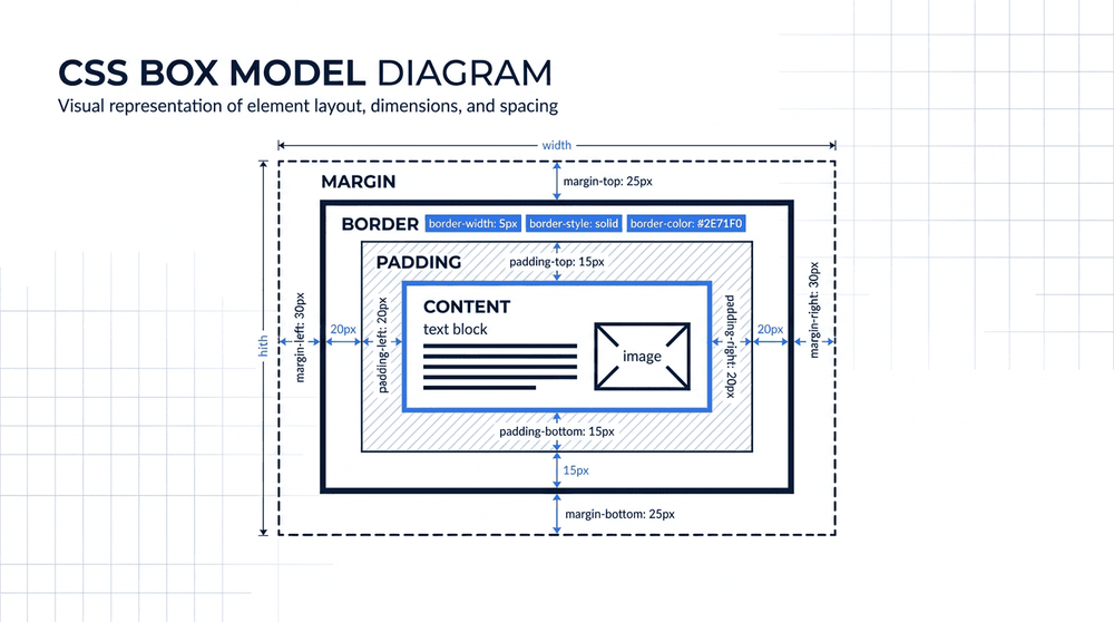
Every HTML element is treated as a rectangular box consisting of content, padding, border, and margin. CSS3 extends this model with properties like border-radius, which rounds box corners, and box-shadow, which adds depth without extra markup. Flexbox, introduced in CSS3, moves beyond the static box model to distribute space and align items dynamically along one axis. Together, these properties give developers precise control over how elements are sized, spaced, and visually rendered across different screen sizes.
CSS3 is organized into independent modules, each covering a distinct area of styling functionality. Flexbox (the Flexible Box Layout module) provides a one-dimensional layout model for distributing space along a row or column, making it straightforward to align and reorder items regardless of their size. CSS Grid extends this with a two-dimensional system, allowing developers to define both rows and columns simultaneously and place elements precisely within a named grid structure. Together, these two layout modules replaced most of the older techniques—such as floats and table-based layouts—that developers relied on before their widespread adoption.
Beyond layout, CSS3 introduced transitions and animations for controlling how properties change over time, enabling smooth visual effects without JavaScript. Media queries allow stylesheets to apply different rules based on viewport dimensions, screen resolution, or device orientation, forming the technical foundation of responsive web design. Custom properties (often called CSS variables) let authors define reusable values with the --variable-name syntax, which can then be referenced anywhere in the stylesheet and updated dynamically at runtime, reducing repetition and making large stylesheets significantly easier to maintain.
A comparison of key CSS3 modules by purpose, browser support, and typical use context. IE 11 support varies by module and may require fallbacks or polyfills.
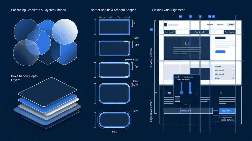
CSS3 reduces reliance on JavaScript and external images for visual effects—gradients, shadows, animations, and rounded corners are all achievable in pure CSS, keeping pages lighter and easier to maintain. On the downside, browser inconsistencies mean certain features behave differently across implementations, often requiring vendor prefixes or fallbacks. The cascade itself can also become a source of complexity in large codebases, where specificity conflicts and inherited styles produce unexpected results that are difficult to debug.
CSS3 is most widely applied in responsive layout design, where features such as Flexbox and CSS Grid allow developers to build interfaces that adapt fluidly across screen sizes — from mobile phones to wide desktop monitors. Custom properties (CSS variables) extend this capability by enabling centralized theming, where a single set of values for colors, spacing, and typography can be updated globally without touching individual rules. This makes CSS3 particularly well-suited for design systems and component libraries, where visual consistency across many pages and states is a core requirement.
Beyond layout, CSS3 is heavily used for UI animation and interactive feedback — transitions on hover states, keyframe animations for loading indicators, and smooth transforms that communicate state changes without JavaScript. In accessible design contexts, CSS3 features such as prefers-reduced-motion media queries allow developers to respect user preferences for reduced animation, making it possible to deliver polished visual experiences while still meeting accessibility standards. These use cases together make CSS3 a foundational layer in practically any modern web project, regardless of the JavaScript framework or backend technology in use.
CSS3 represents a fundamental shift in how visual presentation is handled on the web. Rather than delivering a single monolithic specification, the CSS Working Group restructured the language into independent modules—each evolving at its own pace—allowing browsers to implement and ship new capabilities incrementally. This modular design has enabled features like Flexbox, CSS Grid, custom properties, and hardware-accelerated animations to reach developers without waiting for an entire specification to stabilize. The result is a styling language that has grown steadily more expressive while remaining grounded in a consistent, declarative syntax.
For web developers, CSS3 is not simply a set of visual enhancements but a layout and design system capable of handling complex responsive interfaces, interactive states, and dynamic theming entirely within the browser. Its broad support across modern browsers and the continued publication of new modules through the CSS Working Group mean the language is actively maintained rather than static. Understanding CSS3—from its cascade and specificity model to its newer layout and animation capabilities—remains one of the foundational competencies for anyone building for the web.