Mobile app design

We design mobile apps that feel exactly as they should — native to the platform, intuitive for the user, and built around the specific goals that matter to your business. Rather than adapting a generic template to your brief, we start from user needs and work outward: mapping flows, defining interactions, and making deliberate decisions about every screen before a single line of code is written. The result is an interface that earns trust on first use, reduces friction at every step, and scales with your product as it grows. If you're building something that users will open every day, the design has to be right from the start — and that's exactly what we focus on.

Figma

About web and app design

Web and app design are crucial elements in creating a positive user experience. Design involves not only aesthetics but also functionality and usability. It encompasses layout, navigation, color schemes, and visual elements that contribute to a cohesive and visually appealing interface. Web design focuses on websites accessed through browsers, while app design pertains to the user interface and experience within mobile applications. Both areas emphasize creating intuitive, user-friendly designs that enhance the overall usability of digital platforms.
Built to work. Designed to love.

What We Design

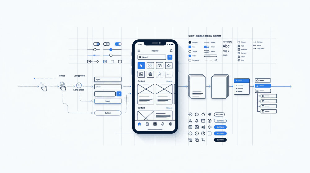
Our mobile app design work covers the full range of what makes an app usable and coherent. We map out UX flows that reflect how real users move through a product — from onboarding sequences to core task completion paths — before a single screen is visually designed. From there, we build out the visual interface in detail: typography, colour, spacing, component states, and the transitions between screens. The result is a design that doesn't just look right in a static mockup but holds together when someone is actually tapping through it.

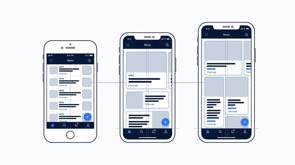
We work natively across both iOS and Android, respecting platform conventions — Apple's Human Interface Guidelines and Google's Material Design principles — rather than forcing a single layout onto two different ecosystems. Alongside screen-level designs, we produce a design system: a shared library of components, tokens, and interaction patterns that developers use directly during build. This keeps the final product consistent with what was designed, and makes future updates faster because the foundations are already in place.

Image

From Flow to Screen

Before we open a design tool, we map how users move through your app — every decision point, every dead end, every shortcut. Those user journey maps become the skeleton of our wireframes: low-fidelity layouts that define structure and interaction without the distraction of colour or polish. We test assumptions at this stage, not after development has started. The result is a clear, validated blueprint that the visual design phase can build on with confidence.

What Sets a Custom Design Apart

A generic approach cuts corners at every stage. A custom, user-centred process addresses each stage deliberately — reducing rework, cutting post-launch fixes, and building something users actually want to use.

Generic App ApproachNebulae's Custom Process
DiscoverySkip straight to wireframes based on assumptionsStructured discovery sessions to map user needs, business goals, and technical constraints
User ResearchLittle or no research; rely on templatesInterviews, persona development, and user journey mapping before any screen is drawn
Information ArchitectureDefault navigation patterns copied from similar appsIA designed around how your specific users think and move through tasks
UI DesignPre-built component libraries applied with minimal customisationBrand-aligned visual design with a consistent, purposeful component system
PrototypingStatic mockups handed off without validationInteractive prototypes tested with real users before development begins
IterationChanges handled as paid extras after handoffFeedback loops built into every stage so issues surface early, not after launch
Handoff to DevelopmentDesign files with gaps that developers interpret freelyAnnotated, spec-ready files with defined tokens, states, and edge cases
Image

Design That Scales

A coherent design system — defined typography, a consistent colour palette, and a reusable component library — is what separates a product that ships cleanly from one that grows messy over time. We establish these foundations early so that every new screen, feature, or platform extension you add later stays visually and functionally consistent. That consistency isn't cosmetic: it reduces design debt, speeds up future development, and means your team spends less time re-solving problems that were already solved.

How We Work

Every design engagement starts with a structured discovery phase where we get into the specifics of your product: who your users are, what problems they're trying to solve, and what success looks like for your business. From there, we move into wireframing and low-fidelity prototyping, which lets us validate the core user flows before investing time in visual design. We share working prototypes early and often — not polished decks — so feedback is grounded in something real and actionable rather than hypothetical. This keeps iteration cycles short and ensures we're solving the right problems before locking in design decisions.

Once the structure is sound, we move into high-fidelity design and build out a component system that maps directly to how the application will be implemented. We work closely with the development team throughout — not as a separate handoff at the end — which means edge cases, responsive behaviours, and interaction states are resolved in design before they become engineering problems. Final deliverables include production-ready assets, annotated specs, and a design system that developers can build from without needing to interpret or guess. The result is a smoother build process and a shipped product that matches the intended experience.

A well-designed mobile app does more than look good — it reduces the friction that drives users away, lowers the volume of support requests that stem from confusing flows, and signals to every person who opens it that the product behind it was built with care. At Nebulae, we design to that standard: clear navigation, purposeful interactions, and interfaces that hold up across the real variety of devices and contexts your users bring to the table. That's the bar we hold ourselves to on every project, and it's the bar we'd hold ourselves to on yours.

Frequently Asked Questions

Find answers to common questions about our services

Like what you see?

Get in touch and we will be happy to discuss your project.